
Best Midjourney Prompts: 10 Templates for Better Images
You type “a stylish portrait in a beautiful setting” into Midjourney, press enter, and get an image that looks polished but generic. The subject is there. The mood is close. Yet the composition, lighting, and visual identity aren’t what you had in mind, and it’s unclear which word to change first.
The difference usually lies in prompt structure, not luck. Midjourney’s official documentation treats parameters as controls that belong at the end of the prompt, while its prompt basics describe image prompts, multiple text phrases, and parameters as distinct ways to guide a generation. A useful prompt therefore separates the visual brief from the technical controls.
The ten Midjourney prompt templates below are repeatable starting points for scenery, portraits, products, environments, editorial scenes, and abstract work. Each example shows what the wording is doing and which parameter or variation can change the result. Use them as testable recipes, not as magic formulas.
Table of contents
- 1. The Descriptive Adjective Layering
- 2. The Cinematic Shot List
- 3. The Composition Grid and Rule of Thirds
- 4. The Color Palette Prescription
- 5. The Art Movement and Medium Mashup
- 6. The Mood Board Reference Chain
- 7. The Technical Render Specification
- 8. The Negative Space and Minimalist Framework
- 9. The Detailed Action and Narrative Moment
- 10. The Sensory Language and Emotional Descriptor Map
- 10-Point Comparison of Midjourney Prompt Techniques
- Turning These Templates Into Your Own Prompt Library
1. The Descriptive Adjective Layering
A vague adjective leaves Midjourney too much room to decide. “Beautiful,” “cool,” and “dramatic” can point in many directions. Specific descriptors narrow the brief by controlling light, texture, emotional tone, material, and finish.
Start with the broad visual condition, then move toward details that change the image. A wide scene might read:
Misty, golden-hour light, dramatic clouds, weathered rocks, serene atmosphere, high detail, Kodachrome color, landscape photographyA portrait needs a different order:
Sharp focus, warm skin tones, soft natural light, gentle expression, luminous atmosphere, painterly finish, timeless portraitThe first prompt establishes a scene. The second establishes a face, light, and rendering approach. Neither depends on a pile of interchangeable synonyms.
Make each word earn its place
Modifiers work best when they add a distinct constraint. “Weathered rocks” changes the surface. “Golden-hour light” changes the illumination. “Serene” changes the emotional reading. Repeating “highly detailed, extremely detailed, hyper-detailed” spends attention without adding much information.
Use intensifiers sparingly. “Subtly luminous” can create a different result from “luminous,” but stacking both may muddy the instruction. Contrasts can help when they describe a deliberate tension, such as “brutally sharp yet dreamy” or “hyper-detailed yet minimalist.”
Draft freely, then edit. George Orwell’s rule, “If it is possible to cut a word out, always cut it out,” gives this process a useful test. Orwell’s six writing rules support direct language, active construction, and fewer worn-out phrases.
For tested combinations across visual categories, the Prompt Like A Pro AI image prompt guide can help you compare adjective choices. Change one descriptor at a time during prototyping. That way, you learn what each term contributes instead of guessing why the whole prompt changed.
2. The Cinematic Shot List
Cinematic prompts work like compact directions for a camera operator. They describe the shot, lens, light, and composition instead of naming only an abstract mood. The method suits product photography, portraits, fashion scenes, and environments where perspective matters.
Try this luxury product brief:
Matte black perfume bottle on a travertine pedestal, close-up, 85mm lens, f/1.8, studio lighting with a narrow rim light, shallow depth of field, restrained editorial product photographyThe lens and aperture suggest how much of the scene should remain sharp. The rim light separates the bottle from the background. The pedestal gives the product a physical setting rather than leaving Midjourney to invent one.
For an environmental portrait, change the camera language:
Environmental portrait of a ceramicist in a sunlit workshop, wide shot, 35mm lens, golden-hour sunlight, practical lamps, centered composition, natural documentary color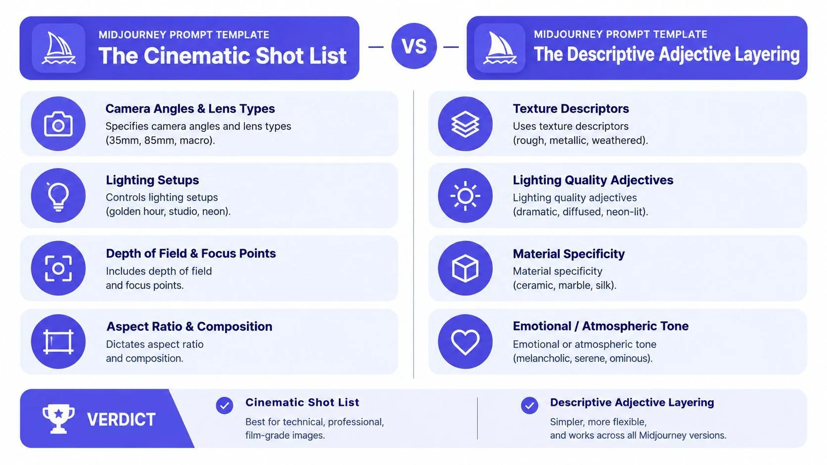
Use technical language with restraint
Camera terms can improve control, but they aren’t a substitute for a subject. “85mm lens” doesn’t tell Midjourney what to photograph. Put the person, object, or place first. Then add the lens and light that support the intended view.
A locked tripod suggests stability. Handheld suggests movement and immediacy. A dolly shot can imply cinematic motion, but it may have little value in a still image unless you want that sense of momentum. Save successful camera and lighting combinations as reusable building blocks.
The cinematic image generation prompt library is useful when you know the subject but haven’t chosen the shot language.
Place the image reference near the opening when a visual source matters.
Then test the same subject with a different focal length or light setup. You can compare the outputs without rewriting the entire brief.
3. The Composition Grid and Rule of Thirds
A prompt can name every object in a scene and still produce a weak image if it doesn’t say where those objects belong. Composition language gives Midjourney a spatial plan. It tells the model what should sit in the foreground, what should recede, and where the eye should land.
For a landscape, use a clear arrangement:
Alpine lake at dawn, foreground wildflowers out of focus, misty water in the midground, snow-covered mountains in the background, rule of thirds, horizon on the lower line, lone cabin at the left intersection, balanced negative spaceThe foreground creates depth. The lower horizon gives the sky room. The cabin becomes a visual anchor without sitting in the center.
A still life benefits from a different structure:
Brass desk lamp, fountain pen, and open notebook, pyramid composition, main lamp slightly left of center, supporting objects forming a diagonal toward the lower right, open negative space on the right, warm window lightDescribe visual weight, not just position
Compass directions help when the arrangement matters. “Subject in the upper left” is clearer than “subject off to the side.” For asymmetry, explain the balance: “heavy on the left, light on the right” or “small subject against a broad empty field.”
You can combine this template with the cinematic shot list. A wide shot changes how the rule of thirds reads compared with a close-up. A low camera angle gives the lower intersection more force than an overhead view.
Practical rule: If the image needs room for a headline, say where that room belongs. “Open sky on the right for editorial text” is more useful than “clean composition.”
Use “balanced” for calm layouts and “dynamic” for movement or tension. These words won’t replace spatial instructions, but they can reinforce the intended rhythm.
4. The Color Palette Prescription
“Colorful” gives Midjourney a broad invitation. A named palette gives it a hierarchy. Specify the dominant color, supporting color, accent, temperature, and saturation when those choices matter to the work.
For a moody editorial image:
Portrait of a woman in a rain-darkened city, dominant charcoal and deep teal, burnt sienna accent, cream highlights, desaturated palette, cool ambient light with warm reflected signs, restrained contrastThe palette separates the main field from the accent. It also prevents every object from competing for attention.
A vivid graphic brief can use stronger relationships:
Abstract poster with layered geometric forms, electric lime dominant, hot pink secondary, deep purple accent, high saturation, complementary color pairing, bright clean lighting, sharp edgesMinimal work needs even fewer ingredients:
Matte ceramic vase on a seamless background, monochromatic off-white palette, single matte black accent, warm undertones, soft side lighting, quiet editorial product photographSeparate color from illumination
Color names describe pigment or grading. Light changes how those colors appear. Warm colors under cool light may look restrained, while cool colors under warm light can become more atmospheric. Add the lighting condition instead of expecting the palette to do both jobs.
You can reference a paint system, a known film grade, or a defined design tradition when that reference clarifies the look. Don’t add names to make the prompt sound more complex than it is. The useful test is whether the reference gives you a palette you could describe to another designer.
Try the same palette on a portrait, product, and environment. If it works across subjects, it may become part of a coherent visual system.
5. The Art Movement and Medium Mashup
Art movements provide visual vocabularies. Mediums provide execution. Combining them can give a prompt both historical character and a clear surface treatment.
Start with a character design:
Art Deco character design, Klimt-inspired gold accents, digital illustration, jewel tones, symmetrical composition, decorative border, crisp ornamental details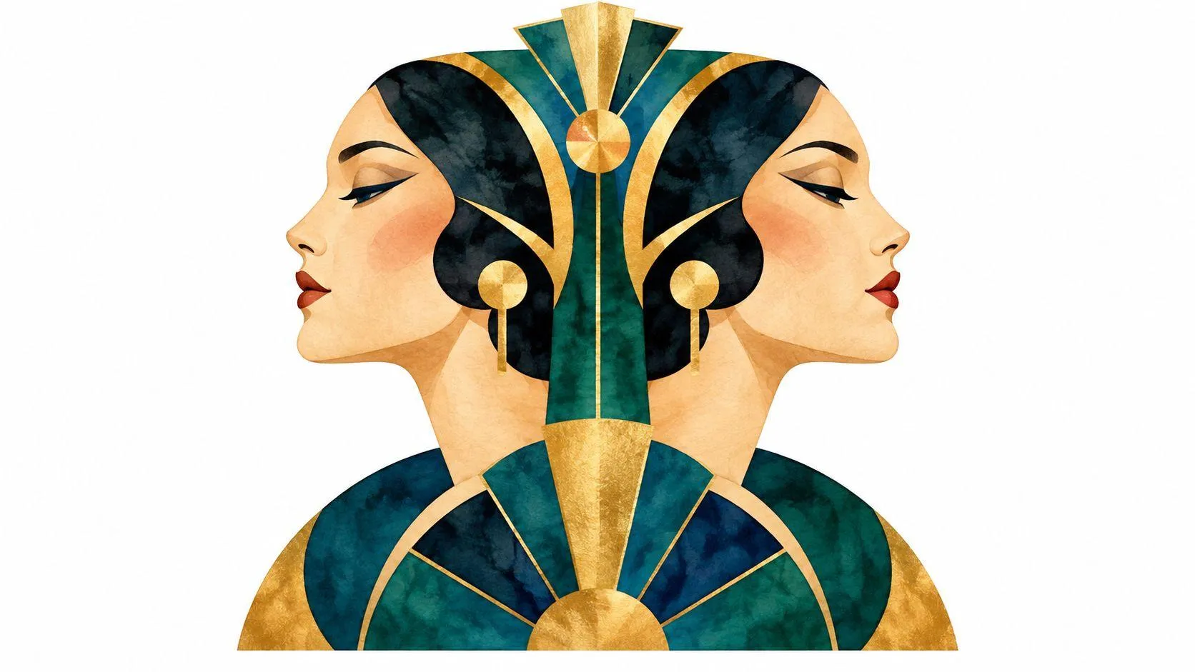
For an environment, shift the references:
Brutalist civic building, Constructivist graphic design influence, monochromatic concrete palette with one vermilion accent, screen-printed texture, strong geometric shadowsA product brief can use a lighter contrast:
Memphis design influence, pastel colors, geometric shapes, playful asymmetry, glossy finish, studio product photographEach example joins a visual language with a medium or finish. The combination does more work than a string of fashionable style words.
Keep the mashup coherent
Two or three movement references can create a useful hybrid. More may create visual noise, especially when the movements use conflicting forms, palettes, or levels of ornament. Test one movement first. Then add a second reference only when you know what needs to change.
Movement names often work without the phrase “in the style of.” Naming Bauhaus, Art Deco, or Constructivism can be enough to guide shape, layout, and color. Add a medium such as digital illustration, screen print, collage, or 3D render to control the surface.
A useful variation: Pair a historical movement with a contemporary production method. “Art Deco, hypermodern 3D rendering” creates a clearer contrast than several historical labels competing for control.
Use associated palettes when the movement alone produces inconsistent color. Bauhaus primary colors, Impressionist pastels, and Art Deco metallic accents can anchor the result without overloading the composition.
6. The Mood Board Reference Chain
A reference chain points Midjourney toward a visual world that would take many adjectives to describe. Films, photographers, designers, and art movements can each contribute a different part of the brief. The strongest prompts explain what each reference contributes.
For a science-fiction environment:
Futuristic desert research station, mood of Blade Runner 2049 for scale and atmosphere, Hoyte van Hoytema-inspired cinematography for natural light, neon accents in deep shadow, austere dystopian elegance, wide compositionThe film reference supplies a mood. The cinematography reference suggests how the scene should be photographed. The written details keep the result tied to a specific subject.
An intimate portrait might read:
Studio portrait of an older woman, reference to Richard Avedon for direct psychological presence, natural light, high contrast, restrained 1950s photographic color, plain background, quiet expressionA fantasy environment can use different source roles:
Enchanted hillside village, Studio Ghibli production design for warmth and lived-in detail, Ruan Jia concept art for luminous fantasy atmosphere, painterly surfaces, storybook scale, soft evening lightExplain the reason for every reference
A title alone can be too broad. “Like Dune: Part One for scale and majesty” tells Midjourney more than a list of film names. One primary reference plus supporting references usually gives you a cleaner hierarchy than a long chain of unrelated influences.
This approach also carries practical risks. A reference may pull in recognizable details you don’t want, and famous names can dominate the subject. If the result becomes too derivative, remove the secondary reference or replace it with concrete visual language.
Use Midjourney’s documented image-reference controls when a supplied image should influence the result. In Version 7, the official documentation lists image weight from 0 to 3, giving users a way to adjust the strength of an image reference. Midjourney’s parameter documentation explains how these controls sit at the end of the prompt.
7. The Technical Render Specification
A render specification tells Midjourney what kind of digital image it should resemble. It can guide product visualizations, game assets, architectural scenes, and polished 3D concept work. The key is to combine a production method with materials, light, and subject.
For a product visualization:
Sculptural wireless speaker, Octane render, physically based materials, matte ceramic body, brushed metal grille, realistic reflections, soft studio lighting, commercial product photographyFor a game asset:
Abandoned coastal rover, Unreal Engine real-time render, high-poly detail, worn painted metal, wet rubber tires, subsurface scattering on translucent panels, AAA game asset, dramatic overcast lightAn architectural brief needs its own priorities:
Compact public library interior, V-Ray render, photorealistic natural daylight, pale oak, exposed concrete, material precision, architectural visualization, wide-angle viewMatch the engine language to visible details
An engine name by itself rarely creates a complete image. Add the material that should catch light, the surface that should show wear, and the reflection or shadow behavior that makes the scene believable.
Resolution terms can signal a finished technical look, but they shouldn’t replace visual direction. “8K resolution” won’t fix a weak composition or an unspecified subject. Pair it with a camera setup or a material brief when you need a polished result.
You can also combine render language with photography:
Octane render, shot like commercial photography, controlled studio setup, physically based glass, softbox reflection, dark neutral backgroundThat hybrid works well for mockups because it gives Midjourney both a digital production cue and a photographic framing cue. Save successful combinations as complete recipes rather than collecting isolated buzzwords.
8. The Negative Space and Minimalist Framework
Minimal images need precise subtraction. If you don’t describe the empty field, Midjourney may fill it with extra objects, decoration, or environmental detail. State the focal point, the amount of open space, and the elements that must stay out.
For a product showcase:
Single matte ceramic vase centered slightly left, generous negative space, plain warm-white background, soft contact shadow only, uncluttered product photography, no flowers, no labels, no extra objects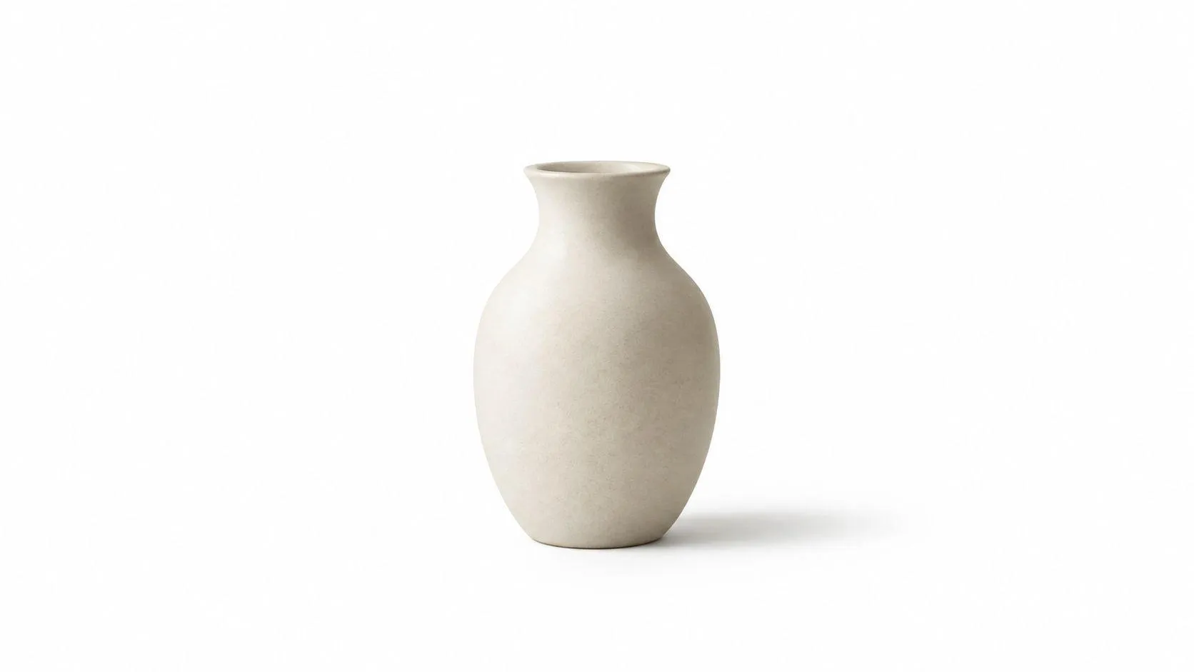
For a portrait:
Minimal portrait of a seated man on the left third, broad empty space around the figure, soft monochromatic grey background, gentle side light, quiet editorial composition, no furniture, no propsFor a conceptual image:
Single red thread suspended in a pale room, stark composition, careful emptiness, one focal point, restrained shadows, visual silence, no clutter, no decorative objectsUse exclusion as a control
Midjourney documents the –no parameter for negative prompting. Put it at the end with the other parameters:
Single object on a pale background, generous negative space, soft shadow, editorial product photograph --no text, logo, watermark, clutterThe parameter is more direct than repeating “without” throughout the prose. It also keeps the visual description separate from the exclusions.
Negative space is useful for brand layouts because the image can sit beside a headline, product detail, or callout. But don’t overload a minimalist prompt with a long list of prohibitions. The shorter the scene description, the more clearly the subject and empty field can work together.
Keep the background color aligned with the broader brand palette. A quiet off-white field, one object, and a controlled shadow often give you more usable flexibility than a richly decorated scene.
9. The Detailed Action and Narrative Moment
Static nouns produce posed images. A specific action produces a moment. Start with what the subject is doing, then add the object, gesture, setting, expression, and camera view that make the action believable.
A quiet scene could use this prompt:
Woman gazing through a rain-streaked window, hand resting on the glass, afternoon light across her face, solitary, peaceful introspection, close three-quarter framing, soft muted colorsThe hand and glass create an interaction. The light gives the moment a time and direction. The emotional phrase supports the action without replacing it.
For movement:
Dancer mid-leap across a sunlit rehearsal room, arms outstretched, torso turning forward, loose fabric trailing behind, joyful concentration, motion frozen at its peak, low-angle wide shotFor intimacy:
Two friends leaning toward each other in close conversation at a kitchen table, hands around warm mugs, genuine laughter, evening practical lights, comfortable intimacy, documentary photographyChoose the instant, not the whole story
Continuous present tense helps anchor a frozen frame. “Reaching,” “turning,” “gazing,” and “leaning” describe a visible state. “She had left the room” describes a backstory that Midjourney can’t reliably stage.
Specific contact points also improve the scene. Name what the subject holds, touches, pushes, or looks toward. “Person running” is broad. “Runner gripping a torn race bib while turning toward the finish line” gives the image a clearer physical event.
Pair action with camera language only after the movement is clear. A low angle can make a leap feel powerful. A close shot can turn a small hand gesture into the story. Too many actions in one prompt create a crowded scene, so choose one decisive moment.
10. The Sensory Language and Emotional Descriptor Map
Some images need to evoke a feeling before they communicate a subject. Emotional language can guide color, light, texture, and distance, but it must remain concrete enough for Midjourney to visualize.
For nostalgia:
Empty suburban kitchen at dusk, melancholic solitude, 1980s nostalgia, faded memory quality, bittersweet warmth, analog photography feel, soft focus like remembering, muted amber and blueFor tension:
Narrow hallway before a storm, anxious anticipation, weighted heaviness, unsettled calm, cool shadows, airless stillness, one harsh light source, cinematic compositionFor transcendence:
Vast mountain valley beneath a break in the clouds, sublime beauty, overwhelming awe, spiritual elevation, light pouring onto the landscape, timeless stillness, luminous atmosphereEach prompt joins an internal state with sensory evidence. “Melancholic” becomes faded color and soft focus. “Anxious” becomes a narrow space and a hard light. “Awe” becomes scale and a break in the clouds.
Replace generic emotion with a visible condition
“Beautiful” and “awesome” don’t tell Midjourney what to render. “Poignant longing,” “luminous reverence,” and “eerie peace” offer stronger directions, especially when paired with a place, period, texture, or lighting condition.
Temporal framing can make abstract mood more specific. “Anxious but set in the 1970s” gives the emotion a visual world. “Nostalgic, faded family photograph, late summer” gives it color and surface cues.
Try the same subject through different emotional maps. A portrait can become intimate, ominous, tender, or distant without changing the person. This makes the template useful for editorial concepts, album artwork, book covers, and visual campaigns.
Editing test: Remove every emotional word that doesn’t change the light, color, gesture, setting, or texture. Keep the phrases that produce a visible consequence.
10-Point Comparison of Midjourney Prompt Techniques
| Template | Implementation 🔄 | Resources ⚡ | Expected outcomes ⭐📊 | Ideal use cases 📊 | Key advantages ⭐ | Quick tip 💡 |
|---|---|---|---|---|---|---|
| The Descriptive Adjective Layering | Low 🔄, straightforward adjective stacking | Low ⚡, no special assets or refs | ⭐⭐⭐ Predictable, controllable surface & mood; limited composition | Iterative prompts, portraits, texture/detail control | High precision over texture, lighting, emotion | Order adjectives broad→specific; test one at a time |
| The Cinematic Shot List | Medium 🔄🔄, requires film/photo terms | Medium ⚡⚡, lens/lighting knowledge helpful | ⭐⭐⭐⭐ Film-like, professional detail; clear spatial hierarchy | Storyboards, product/portrait photography, cinematic scenes | Precise control of perspective, depth, emphasis | Combine focal length + aperture; save combos |
| The Composition Grid and Rule of Thirds | Medium 🔄🔄, needs compositional literacy | Low ⚡, conceptual knowledge suffices | ⭐⭐⭐⭐ Balanced, gallery-quality framing; less chaos | Fine art, editorial, still life, layout-focused assets | Predictable, clean compositions; reduces clutter | Specify foreground/midground/background and compass points |
| The Color Palette Prescription | Low–Medium 🔄🔄, needs precise color vocabulary | Medium ⚡⚡, brand/palette references recommended | ⭐⭐⭐⭐ Cohesive, brand-consistent chromatic results | Branding, UI mockups, motion graphics, packaging | Consistent color across subjects; faster iteration | Designate dominant/secondary/accent; reference Pantone or films |
| The Art Movement and Medium Mashup | Medium–High 🔄🔄🔄, art-history/style knowledge | Medium ⚡⚡, artist/movement references useful | ⭐⭐⭐⭐⭐ Expressive, sophisticated, highly varied outcomes | Illustration, concept art, distinctive branding | Rapidly communicates complex style with high nuance | Limit to 2–3 movements; test single-artist first |
| The Mood Board Reference Chain | Low–Medium 🔄🔄, requires good reference selection | High ⚡⚡⚡, relies on known films/photographers/images | ⭐⭐⭐⭐ Very specific mood/aesthetic if reference exists in training data | Agency briefs, concept exploration, collaborative direction | Fast, unambiguous mood transfer; team alignment | Use one primary reference + supporting ones; state why |
| The Technical Render Specification | High 🔄🔄🔄, needs render-engine & pipeline knowledge | High ⚡⚡⚡, engine names, resolution, materials required | ⭐⭐⭐⭐⭐ Distinct digital polish; photoreal/CGI precision | 3D visualization, product renders, game assets | Unambiguous technical aesthetic; high realism and fidelity | Specify engine + resolution + materials (e.g., Octane, 8K) |
| The Negative Space and Minimalist Framework | Low 🔄, simple exclusionary constraints | Low ⚡, minimal refs; numerical specs helpful | ⭐⭐⭐⭐ Clean, design-ready images with strong hierarchy | E‑commerce, hero images, branding, portfolio shots | Clear focal point; easy composability into designs | State percentages: “subject 30% of frame, 70% open space” |
| The Detailed Action and Narrative Moment | Medium–High 🔄🔄🔄, precise action wording needed | Medium ⚡⚡, contextual references improve believability | ⭐⭐⭐⭐ Dynamic, narrative-rich frames; variable anatomy risks | Editorial, book covers, character illustration, storytelling | Conveys motion and story; emotionally engaging | Lead with primary action; use present participles (gazing, reaching) |
| The Sensory Language and Emotional Descriptor Map | Medium 🔄🔄, demands nuanced emotional vocabulary | Low–Medium ⚡⚡, sensory words; optional refs | ⭐⭐⭐⭐⭐ Highly evocative, emotionally coherent and subjective | Conceptual art, fine art, evocative campaigns, personal work | Produces deeply resonant, authored imagery | Pair emotion + sensory descriptors and temporal framing for clarity |
Turning These Templates Into Your Own Prompt Library
The best Midjourney prompts aren’t fixed strings that work for everyone. They are structured experiments. Midjourney’s official documentation separates the visual description from parameters and lists controls for aspect ratio, chaos, quality, stylization, tiling, versions, and negative prompting. That makes it easier to test one creative decision against one technical decision.
Start with a simple record for every useful generation:
- Visual brief: Subject, action, setting, medium, light, palette, and composition.
- Technical controls: Model version, aspect ratio, style settings, reference type, and weights.
- Iteration note: What changed, what improved, and what became worse.
- Reuse note: Which future subject could use the same structure.
Midjourney prompting is iterative. Independent research collected 268,000 public Discord messages over 28 days, including 248,000 user-generated prompts paired with generated images. The same dataset found that 60% of requests created new images and 40% upscaled previous generations, which supports a workflow built around generation, evaluation, variation, and refinement. The dataset README provides that underlying record.
Change one variable at a time
Don’t replace the subject, lens, palette, and aspect ratio after every result. If you change everything, you won’t know what caused the improvement. Keep the visual brief stable, then test a different focal length. Keep the camera stable, then test a warmer palette. Keep the prompt stable, then adjust the reference strength.
Start with Descriptive Adjective Layering and The Cinematic Shot List. Together, they teach the two foundations most creators need first: what the image should feel like and how the camera should see it. In later sessions, add one new template at a time. Composition is a strong next test for layouts, while negative space is useful for products and branded assets.
Build records, not a gallery of guesses
A gallery shows outcomes. A prompt library preserves the recipe that produced them. For each keeper, save the exact wording, parameters, reference details, and a short note about the iteration. Include enough information for another person to reproduce the attempt or intentionally avoid it.
This is especially important when personalization enters the workflow. Midjourney documents personalization through user image rankings and the –p parameter. Its documentation also describes stylization as a separate control on a 0 to 1000 scale, with 100 as the default, so two users can enter similar prompts and still receive different results. Midjourney’s personalization documentation explains why a compact reproducibility record should include personalization state as well as prompt text.
Prompt Like A Pro offers a free prompt library and generator that can help structure visual elements for Midjourney without an account. Its questions-first flow is useful when a brief is still vague, while its cinematic image prompt capability organizes camera, lighting, color, composition, and model-specific details.
The practical goal isn’t to find one perfect prompt. It’s to create a small set of dependable structures, understand which variable each one controls, and reuse them with judgment. Write the brief plainly, cut words that add no visual constraint, and let every parameter serve a clear purpose.
Prompt Like A Pro offers a free generator that asks clarifying questions and produces structured prompts for Midjourney and other AI tools, plus a library of ready-to-use examples. Visit Prompt Like A Pro to turn a vague image idea into a clearer visual brief you can test and refine.
Ready-made prompts for this
Build yours with the wizard
Prompt Like A Pro asks a few questions about your task, then writes a complete prompt for ChatGPT, Claude or Gemini. Free, no signup.
Make a prompt →Read next
Prompt Engineering vs Fine Tuning: Which Wins in 2026?
Prompt engineering vs fine tuning, compared on data needs, cost, latency, reversibility and portability, with a checklist for choosing the lighter option.
Read the guide →