
10 Marketing Copy Examples That Drive Action
Effective marketing copy is usually clear before it’s clever. The earliest known surviving example of persuasive advertising copy is often dated to 1477 in England, when a prayer-book advertisement was printed and displayed on church doors. By 1625, ads appeared regularly in newsbooks, and by 1652, readers were already complaining about the amount of advertising in those publications. The channels changed, but the work stayed familiar: name a need, make a promise, give people a reason to believe it, and show them what to do next. Copywriting’s history makes that continuity hard to miss.
This list takes a practical view of marketing copy examples. It doesn’t collect famous slogans for admiration. Each example works in a real format, from a headline and tagline to an ad, email, social post, SMS message, button, and testimonial. For every line, the useful questions are the same: What problem does the reader have? What benefit does the copy promise? How does the wording reduce doubt? What action should follow?
The examples use short words, active verbs, and concrete meaning. That approach follows George Orwell’s six rules for clearer prose: avoid stale metaphors, prefer short words, remove unnecessary words, use active voice, avoid jargon when plain English works, and break the rules when needed to avoid saying something barbarous. Read Orwell’s full essay. Let’s get to the lines.
Table of Contents
- 1. Headline “Stop Rewriting Prompts. Start Getting Results.”
- 2. Tagline “Questions First. Better Prompts. No Signup.”
- 3. Product Description “An Interview, Then a Prompt”
- 4. Email Subject Line “Your Prompts. Saved. No Account.”
- 5. Ad Copy “Save 10 Hours a Month on Prompt Drafting”
- 6. Landing Page Hero Line “Get Better AI Responses. Fast.”
- 7. Social Media Caption “Five Questions. One Structured Prompt. No Sign-up.”
- 8. SMS Message “Try Prompt Like A Pro free. No signup. Get better AI outputs in 2 min. promptlikea.pro”
- 9. Call-to-Action Button “Create a Prompt”
- 10. Testimonial Snippet “I stopped wasting time on five drafts of the same prompt. First try works now.”
- 10 Marketing Copy Examples Compared
- Turn These Patterns Into Working Copy
1. Headline “Stop Rewriting Prompts. Start Getting Results.”
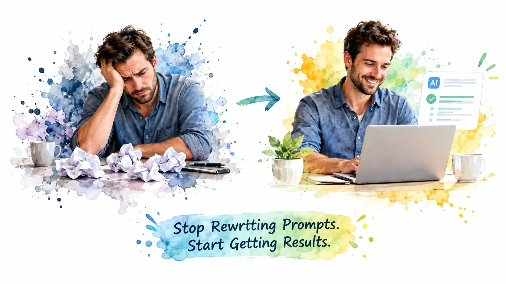
Prompt users often know what they want from an AI assistant, yet they keep rewriting the prompt because the first response misses the audience, format, tone, or constraints. “Stop Rewriting Prompts. Start Getting Results.” names that frustration without explaining it at length. The first sentence identifies the wasted effort. The second points toward the outcome.
The copy also works because it uses ordinary verbs. “Stop” and “start” create movement, while “rewriting prompts” and “getting results” give the reader a clear contrast. There’s no vague promise about innovation, intelligence, or transformation. A busy marketer can understand the value in a glance.
A landing-page hero line like this should appear before the reader has to scroll. The supporting copy must then explain how the product earns the promise. For Prompt Like A Pro, that mechanism can be expressed as a short sequence: answer questions about the task, then receive a structured prompt ready for the chosen AI assistant.
Why the line earns attention
The trade-off is that the promise stays broad. “Results” could mean a better draft, a clearer answer, or fewer revisions. That’s acceptable in a headline when the subheading supplies the missing detail. A more cautious audience may respond better to “Spend Less Time Rewriting Prompts,” while a performance-focused audience may prefer the stronger contrast.
Practical rule: Put the reader’s costly habit in the first phrase, then show the desired change in the second.
To adapt this pattern, replace “rewriting prompts” with the behavior your audience wants to stop. Then name the outcome in plain language. Keep the headline short, put it above the fold, and let the next line explain the mechanism rather than adding another slogan.
2. Tagline “Questions First. Better Prompts. No Signup.”
A tagline has less room than a headline, so every phrase must carry a separate job. “Questions First. Better Prompts. No Signup.” answers three concerns in quick succession. “Questions First” explains the method. “Better Prompts” states the benefit. “No Signup” removes a common barrier.
The periods create a firm rhythm. Each phrase stands alone, which makes the line easy to scan in a website header, social profile, or email signature. The structure also avoids the usual problems of taglines. It doesn’t rely on a metaphor, an abstract value, or a claim the visitor can’t test.
The reader problem here is uncertainty. A first-time visitor may wonder whether the tool just produces another generic prompt, whether it asks for personal details, or whether using it requires a long setup. The tagline handles those questions before the visitor has to search for an explanation.
Keep every phrase defensible
“Better Prompts” sounds useful, but it still needs proof nearby. A product page can show the questions asked, the structure of the output, and the target model format. The phrase shouldn’t stand alone as an unsupported boast. “No Signup” is more concrete, so the product must keep that promise consistent across the experience.
The line also has a trade-off. Its clipped rhythm feels efficient, but it leaves out audience and use case. A developer, writer, and student may all understand it, yet they may not see how the tool fits their work. Add audience-specific copy below the tagline rather than weakening the tagline with extra clauses.
- Repeat the promise: Use the line in the header, footer, and a support-team email signature.
- Test the benefit: Ask users whether “Better Prompts” describes the value they notice.
- Protect the rhythm: Don’t add emojis, exclamation marks, or filler words.
Adapt the pattern by writing three short answers: how the product works, what improves, and what the reader doesn’t have to do. If one phrase isn’t true for every user, replace it with a narrower claim you can support.
3. Product Description “An Interview, Then a Prompt”
Feature lists make readers work too hard. They force people to translate technical functions into a possible experience. “An Interview, Then a Prompt” skips that translation. It tells the reader what happens in order.
The product description names two steps. First, the tool asks questions about the task. Then it produces a structured prompt. That sequence is more useful than labels such as “AI-powered,” “smart,” or “next-generation,” because the reader can picture the interaction.
This line suits small spaces, including an app subtitle, a social post, or a product card. It also works above the fold because it doesn’t compete with a longer benefit statement. The trade-off is compression. Someone unfamiliar with prompt tools may still ask what the interview covers or which AI assistant receives the output.
Show the experience, then add the detail
The body copy should answer those questions without changing the core description. Explain that the questions can cover the audience, format, length, and constraints, then show that the final output is formatted for tools such as ChatGPT, Claude, Gemini, or Midjourney. Keep those details below the short line so the reader gets the simple idea first.
A product demo can reinforce the sequence better than another paragraph. It should show the question flow, the generated structure, and the point at which the user copies the result into an AI assistant.
 Google’s 9 Hour AI Prompt Engineering Course In 20 Minutes · Tina Huang · Watch on YouTube →
Avoid parentheses and technical terms in the description itself. If users new to AI can’t explain what happens after reading it, add a plain supporting sentence. The best adaptation follows the same order: name the human interaction first, then name the output.
4. Email Subject Line “Your Prompts. Saved. No Account.”
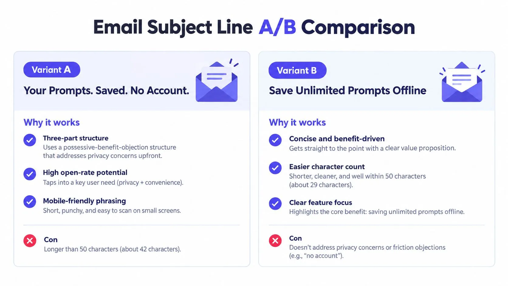
An email subject line must earn the open without pretending the message contains breaking news. “Your Prompts. Saved. No Account.” starts with possession, moves to the benefit, and ends by removing a privacy or access concern. It’s more informative than “Exciting news” and less inflated than “You won’t believe this update.”
The reader problem is easy to understand. People who create useful prompts may want to keep them, but they may not want another account or another stored data trail. “Your” makes the benefit personal. “Saved” makes it concrete. “No Account” addresses the objection directly.
The short sentences also help the line survive narrow inbox layouts. The preview text can explain where the prompts are saved and what the reader should do. It shouldn’t repeat the subject line. Instead, use it to clarify the experience and reinforce trust.
Don’t let the subject overpromise
“Saved” needs a precise explanation in the email. If the prompts are stored locally in the browser, say so. If a feature has limits or requires an optional paid upgrade, explain that before the user feels misled. Clear copy may reduce curiosity clicks, but it improves the quality of the people who do open and act.
An alternative such as “Save Unlimited Prompts Offline” puts the feature first, but it may create a stronger expectation about capacity and access. The three-part version makes a smaller, more defensible promise.
Test the line across Gmail, Apple Mail, and Outlook. Check how the preview text completes the thought, and avoid personalization tokens unless the email system handles them reliably. For an SMS adaptation, write the idea as a natural sentence: “Your prompts are saved. No account needed. Try it.”
5. Ad Copy “Save 10 Hours a Month on Prompt Drafting”
An ad becomes stronger when it turns an abstract benefit into a measurable unit. “Save 10 Hours a Month on Prompt Drafting” gives the reader a concrete productivity claim instead of saying “save time.” That specificity can attract professionals who already think in tasks, schedules, and output.
The claim must be supported by evidence. A marketer should calculate the estimate from a real workflow, state the assumptions, and avoid presenting a typical result if it only applies to a narrow group. The supplied product notes suggest comparing the time spent creating a prompt through the tool with the time spent iterating manually, but those timings must be measured before they appear in an ad.
Specificity creates responsibility
This is the central trade-off. A quantified promise can make an ad easier to understand, but an unsupported number can damage trust and create compliance problems. If the evidence varies widely, use a qualitative line such as “Spend less time drafting prompts” and explain the workflow instead.
The format also matters. Search ads can benefit from direct, task-focused copy because the reader has already expressed intent. Social ads may need a visual demonstration or a short scenario before the same promise makes sense. The ad should match the landing page so the visitor doesn’t have to reinterpret the offer.
- Define the task: Specify what counts as prompt drafting and revision.
- Show the basis: Explain the calculation in the description or landing page.
- Measure the actual action: Don’t judge success by clicks alone.
To adapt this example, quantify only a benefit your team can verify. If you can’t defend the number, keep the sentence concrete without using one. “Draft clearer prompts with fewer revisions” still describes a useful change.
6. Landing Page Hero Line “Get Better AI Responses. Fast.”
A visitor who already uses ChatGPT, Claude, Gemini, or another assistant may not need an explanation of AI. They need a reason to believe the tool can improve the output. “Get Better AI Responses. Fast.” speaks to that experienced user with a direct benefit and a speed promise.
The line works above the fold because it avoids context the reader already has. “Get” is active and reader-focused. “Better AI Responses” names the desired result. “Fast” adds urgency without describing a complex process.
The risk is ambiguity. “Better” can mean more accurate, more useful, better formatted, or more aligned with the task. The supporting line must define the improvement. For example, explain that the user answers task-specific questions and receives a structured prompt customized for a selected AI tool.
Make the mechanism visible
A hero section should connect the promise to one next step. A button such as “Create a Prompt” tells the reader what will happen. A short reassurance such as “Try it free. No signup.” removes friction, but only if the product genuinely supports that experience.
The line can be tested against a process-led alternative such as “Stop Iterating. Start Shipping.” The first version leads with the output. The second leads with the user’s work habit. Neither is automatically better. The winner depends on whether visitors arrive seeking a better result or relief from repeated edits.
For a live example, review the Prompt Like A Pro homepage. Adapt the pattern by choosing one outcome, one qualifier, and one supporting sentence that proves how the product reaches it. Don’t add a second benefit to the hero unless the first one is already clear.
7. Social Media Caption “Five Questions. One Structured Prompt. No Sign-up.”
Social feeds punish vague copy. People scroll past claims they can’t understand quickly, especially when the accompanying image or video doesn’t explain the product. “Five Questions. One Structured Prompt. No Sign-up.” gives the reader a compact journey: input, output, and reduced friction.
The parallel structure creates visual order in a busy feed. “Five Questions” suggests a manageable starting point. “One Structured Prompt” clarifies the deliverable. “No Sign-up” answers the practical concern that often stops a curious visitor from trying a tool.
The caption still needs a visual partner. A screenshot can show the question flow. A short screen recording can show the prompt being generated. Without that proof, the caption may sound like a feature summary rather than a useful demonstration.
Teach one idea per post
The guide to high-conversion social media captions can support a longer version of the post, but the feed caption should stay focused. Don’t add every supported model, audience, and use case to one update. Use the comments, carousel slides, or landing page for those details.
The number “five” also creates a commitment. If the product asks a different number of questions depending on the task, say so or use “A few questions” instead. Precision helps only when it reflects the actual experience.
A practical adaptation might read: “Answer a few task questions. Get a prompt built for your AI tool. Start without an account.” Pair it with a before-and-after prompt screenshot, then invite the reader to try the same task. That gives the caption a clear next step instead of asking for a vague “thoughts?”
8. SMS Message “Try Prompt Like A Pro free. No signup. Get better AI outputs in 2 min. promptlikea.pro”
SMS copy has little space for explanation, so it must put the offer, objection removal, benefit, and destination in a tight order. “Try Prompt Like A Pro free. No signup. Get better AI outputs in 2 min. promptlikea.pro” does that with short phrases and a direct URL.
The reader problem is hesitation. A recipient may assume the tool costs money, requires an account, or takes too long to set up. The message answers all three concerns before the link. “In 2 min” sets an expectation about speed, so the experience should support that promise for the audience receiving the message.
Respect the medium and the permission
The advice to keep an SMS within 160 characters comes from the product plan, but any campaign should count the final message after adding tracking parameters or personalization. Longer messages may split, change the cost, or lose the clean rhythm. A short URL helps, but the destination must work well on a phone.
Don’t use all caps or excessive punctuation. Send only to people who opted into the campaign, identify the sender, and include a simple way to unsubscribe where required. Sending late at night can make a useful message feel intrusive, while a daytime send better fits a task-oriented offer.
The follow-up should continue the same promise rather than introduce a new pitch. For example, a user who tried the generator might receive an invitation to browse the Prompt Library. Adapt the structure by writing one sentence for value, one for friction removal, one for the expected time, and then the destination.
9. Call-to-Action Button “Create a Prompt”
“Get Started” sounds positive but tells the reader almost nothing. “Create a Prompt” names the action that follows the click. The verb gives the user agency, while the noun connects the button to the product’s actual output.
That clarity matters when the page has already explained the tool. The reader doesn’t need another promise on the button. They need to know what will happen next. “Generate a Prompt” may imply a more automatic process. “Build My Prompt” feels more personal. “Start Prompting” is broader and could lead to several different actions.
Match the button to the next screen
The button should open the question flow, not a generic account page or an unrelated feature. Supporting text can remove the last objection: “Try free. No signup.” If the product stores prompts locally or limits certain saves, put that information close to the action when it affects the decision.
Use the same primary CTA across the homepage and tool pages when the next step stays the same. A different button label can be useful for a different stage, but variation for its own sake makes the interface harder to scan.
Track the button click, then track the completed action. A click can rise while completed prompts fall if the next screen is confusing or slow. Conversion-focused copy should be judged by the primary action it drives, not by a proxy alone. Customer Impact’s conversion copy guidance recommends measuring through to the actual conversion event and pairing it with guardrails such as bounce rate or time on page.
Adapt the button by naming the first meaningful action. If the user books a demo, write “Book a Demo.” If they upload a document, write “Upload Your File.” Make the label match reality.
10. Testimonial Snippet “I stopped wasting time on five drafts of the same prompt. First try works now.”
The strongest testimonial language often sounds less polished than brand copy. “I stopped wasting time on five drafts of the same prompt. First try works now.” describes a behavior change rather than praising the product with words such as “amazing” or “game-changing.”
The reader problem is repeated effort. The speaker gives that problem a recognizable shape, then describes the desired change. A skeptical prospect can compare the statement with their own experience. That makes the testimonial useful, but it also raises the standard for verification.
Don’t publish this line without permission and evidence from a real user. Ask open questions such as “What changed after you used the tool?” rather than feeding the customer a preferred answer. Confirm what “first try works” means, because the phrase could refer to a usable draft, not a perfect final result.
Add context without stealing the voice
A name, role, and relevant context can help the reader judge whether the experience applies to them. A content manager may speak to marketers, while a developer may speak to engineers. The attribution should be accurate, and the quote should remain the customer’s language.
Case-study pages need more than a strong quote. Track content performance, including views, time on page, and downloads. Track sales influence, such as whether the case study was shared during a sales cycle. Track pipeline attribution, meaning revenue from deals where the case study appeared as a touchpoint. This case-study guide also gives practical reference points for organic visits and time on page, but those benchmarks shouldn’t replace measurement of your own audience and goal.
Adapt the testimonial by preserving a specific old behavior, a specific new behavior, and the context that makes the change credible. Never turn a customer’s experience into a stronger claim than the evidence supports.
10 Marketing Copy Examples Compared
| Item | Implementation Complexity 🔄 | Resource Requirements 💡 | Expected Outcomes ⭐ / 📊 | Ideal Use Cases | Key Advantages ⚡ |
|---|---|---|---|---|---|
| Headline: “Stop Rewriting Prompts. Start Getting Results.” | Low 🔄, one-line A/B friendly | Small, copywriter + test setup 💡 | High ⭐, clear benefit; boosts CTR 📊 | Landing hero, ads, email subjects | Direct, memorable; easy to test ⚡ |
| Tagline: “Questions First. Better Prompts. No Signup.” | Low 🔄, concise branding line | Minimal, copy + brand alignment 💡 | High recall ⭐, reduces friction 📊 | Site header, social bio, email footer | Clear differentiation; trust signal ⚡ |
| Product Description: “An Interview, Then a Prompt” | Very low 🔄, short sequence copy | Minimal, fits platform metadata 💡 | Clear comprehension ⭐, good for metadata 📊 | App store subtitle, product pages, social | Shows user journey; ultra-compact ⚡ |
| Email Subject Line: “Your Prompts. Saved. No Account.” | Low–Med 🔄, needs preview/length checks | Moderate, email platform + A/B tests 💡 | Strong open potential ⭐, addresses privacy 📊 | Newsletters, SMS, push notifications | Personal, privacy-focused; mobile-friendly ⚡ |
| Ad Copy: “Save 10 Hours a Month on Prompt Drafting” | Medium 🔄, needs credible backing | Moderate, analytics, creatives, case studies 💡 | High attraction ⭐, measurable CTR uplift 📊 | Search ads, LinkedIn, retargeting | Quantified benefit; persuasive and memorable ⚡ |
| Landing Page Hero Line: “Get Better AI Responses. Fast.” | Low 🔄, headline + subhead pairing | Small, copy + design emphasis 💡 | High relevance ⭐, drives CTA clicks 📊 | Homepage hero, landing pages, ads | Benefit + speed; fits mobile & desktop ⚡ |
| Social Media Caption: “Five Questions. One Structured Prompt. No Sign-up.” | Low 🔄, scannable social copy | Small, pairs with image/video 💡 | Good shareability ⭐, drives engagement 📊 | Twitter, LinkedIn, Instagram, TikTok | Scannable, repeatable; social-friendly ⚡ |
| SMS Message: “Try Prompt Like A Pro free. No signup. Get better AI outputs in 2 min. promptlikea.pro” | Medium 🔄, strict char/compliance limits | Moderate, opt-in, short links, legal checks 💡 | High open CTR ⭐, fast conversions 📊 | SMS campaigns, WhatsApp, mobile push | Urgent, concise; high click potential ⚡ |
| Call-to-Action Button: “Create a Prompt” | Very low 🔄, single-button text | Minimal, design + CTA testing 💡 | High clarity ⭐, increases intent to click 📊 | Primary CTA on tool pages, emails, app | Specific action; reduces friction and ambiguity ⚡ |
| Testimonial Snippet: “I stopped wasting time on five drafts of the same prompt. First try works now.” | Low–Med 🔄, needs sourcing & approval | Moderate, collect quotes, attribution, visuals 💡 | Strong social proof ⭐, lifts conversions 📊 | Landing pages, case studies, sidebars, socials | Behavioral detail; authentic credibility ⚡ |
Turn These Patterns Into Working Copy
These examples share a simple editing process. Start with one problem, not a list of everything your product can do. A reader who struggles with repeated prompt revisions doesn’t need a paragraph about every model integration before they understand how the tool helps.
Next, state one concrete benefit. “Better results” may work as a short hero line, but the supporting copy should explain what better means for that audience. It might mean a clearer structure, fewer revisions, a faster first draft, or a simpler setup. Choose the benefit that matters at the point of action.
Then show the mechanism. “An Interview, Then a Prompt” works because it names the experience instead of hiding behind technical language. A product earns trust when the reader can see how the promised result might happen.
Remove one real objection. “No Signup” answers an access concern. “Saved” answers a retention concern. A useful objection must reflect the reader’s actual hesitation, not a generic reassurance added because every landing page seems to have one.
Finally, give the reader one clear action. “Create a Prompt” is stronger than “Learn More” when the next screen really starts prompt creation. The button, subject line, ad, and landing page should all prepare the reader for the same step.
A compact swipe-file test
Before publishing a line, ask:
- Problem: Can the intended reader recognize the difficulty?
- Benefit: Does the copy name one meaningful outcome?
- Mechanism: Does it explain how the product delivers that outcome?
- Proof: Can the team support the claim with real evidence?
- Objection: Does it remove a barrier that actually matters?
- Action: Does the reader know what happens after the click?
- Format: Does the line fit the space and behavior of the channel?
- Trust: Does it disclose limits, data practices, or AI involvement when those details affect the decision?
Don’t copy these lines word for word. Copy their logic, then adapt the language to your audience, evidence, offer, and available space. A social caption needs a fast visual explanation. An email subject needs a useful preview line. A testimonial needs a real person and a verifiable experience. An ad needs a defensible claim, not a dramatic number chosen for attention.
The larger lesson is that persuasive copy doesn’t depend on decorative language. Marketing copy has been formalized as a profession for more than 150 years, and its commercial scale remains significant. One estimate cited by AWAI places the global copywriting services market at $42.2 billion by 2030, a projection reported by WellVersed’s copywriting statistics overview. That scale doesn’t make every polished line effective. It makes disciplined writing more valuable.
Personalization and testing can sharpen a good message, but they can’t rescue a confused one. Personalized calls to action have been widely cited as boosting conversions by over 200%, yet the underlying lesson is broader than the figure. Compare headlines, offers, and CTA wording, then measure the completed action rather than celebrating an isolated click. Trust also matters more as audiences expect transparency about AI use, data practices, and product limits. Recent coverage of copywriting examples highlights that shift toward transparency, human creativity, data-informed decisions, and micro-personalization.
Write the shortest version that still tells the truth. Then test it with the people who must understand it, believe it, and act on it.
Prompt Like A Pro helps writers, marketers, founders, developers, and researchers turn a task into a structured prompt through a questions-first flow. Visit Prompt Like A Pro to create prompts without an account, explore the Prompt Library, and apply the same clear, evidence-led thinking to your own marketing copy.
Build yours with the wizard
Prompt Like A Pro asks a few questions about your task, then writes a complete prompt for ChatGPT, Claude or Gemini. Free, no signup.
Make a prompt →